

The client is Entertainment Weekly. The audience is the readers of Entertainment Weekly which mostly consists of adults over the age of 45. About 59.5% of the readers are female with 40.5% being male, and the median annual household income for the readers of Entertainment Weekly is $68,609.
The purpose of this article is to entertain the audience and inform the audience about It’s Always Sunny In Philadelphia and the new season that ties the show for the record of longest running live-action, American sitcom (14 seasons).
The format for this project is a 2-page opening spread of a featured article for Entertainment Weekly. The article will run in 2019. The size of each page is 71/8x101/2 inches.
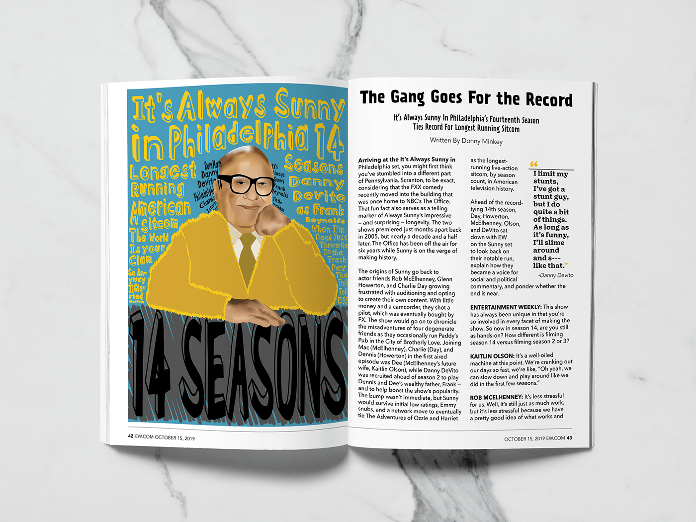
The artwork is a typographic portrait of Danny Devito. The art style will be somewhat cartoonish or juvenile as that is similar to the type style of artwork the network, FX, uses to advertise the show. The typography to be used in the typographical portrait will be a decorative font with hand drawn qualities of someone with poor penmanship. The type included in the typographic portrait will include various key words about It’s Always Sunny In Philedelphia as well as some memorable quotes from Danny Devito’s character, Frank. This artwork appeals to the audience because Danny Devito is one of the more iconic character on the show and one of the most immediately recognizable actor both on the show and in general and the style of artwork to be used resembles that of the network. The artwork will also appear to be intentionally misleadingly bright and “sunny” while still reflecting some of the dingy and edgy aspects that the show actually has.
The color scheme is going to consist primarily of yellow, black, and various greys as well as a bit of blue. This color scheme appeals to the audience because those are the colors used by the series to promote the show and will emit a “sunny” vibe.
The typographic portrait is the focal point. The headline is decorative in a hand-drawn style, the tagline is san serif, the byline is sans serif, the subheads/Q&A are sans serif, the pull quote is slab serif, the body copy is sans serif, and the folios are sans serif. The personalities of the fonts are legible without being too formal or clean. This combination of fonts will appeal to the audience because it’ll reflect the edgy and almost dingy nature of the show.
The typographic illustration was done entirely in Adobe Illustrator, and the spread layout was done in InDesign.


